Unveiling the Magic of Barbie Pink:
Embracing the Power of Packaging
Step into the enchanting world of Barbie-mania with me as we delve into the mesmerizing universe of the newly released Barbie movie.
Amidst the captivating storyline and Barbie's adventures, there's one thing that truly caught my eye—the iconic packaging and the enchanting shade of pink that defines the very essence of Barbie!
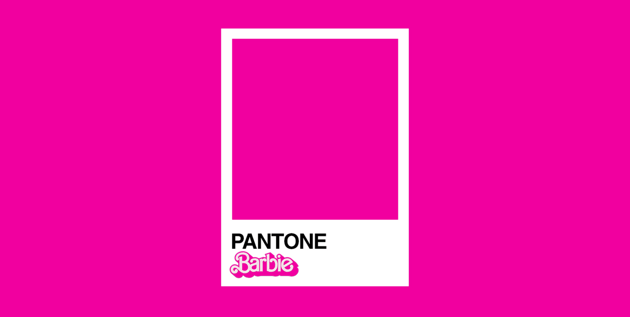
At the heart of Barbie's iconic image lies her Pantone color, "Pantone 219 C." This distinct hue, commonly known as Barbie Pink, is more than just a color—it's a symbol of elegance, playfulness, and boundless imagination. It's incredible to witness how this signature color has left an indelible mark on pop culture and fashion, becoming an enduring part of Barbie's legacy.
We believe that packaging is an art form—an opportunity to weave your brand's narrative and create a lasting impression on your audience.
Much like Barbie's world is painted in pink, every brand has its unique tale to tell. Our passion lies in collaborating with you to bring your brand's story to life through captivating packaging designs.
As we celebrate the magic of Barbie Pink, we find ourselves inspired to infuse that same enchantment into every project we undertake.
Our dedicated team takes joy in crafting packaging solutions that resonate with your target audience, evoking emotions and forging deep connections with your customers.
We are dedicated to creating captivating designs that leave a lasting impression on your audience. Step into the enchanting world of packaging with us.


